Clarity is overrated!
Proof correction is a vital part of journal and book production, and we pride ourselves on being good at spotting and correcting errors (and at not introducing new ones). Everyone who’s ever read a newspaper or a book has enjoyed tut-tutting over a typo, but we’re blissfully unaware of all those other typos we have “auto-corrected” – the ones that passed beneath conscious attention. The apparently simple process of detecting a mistake is actually made more tricky by the brain’s own remarkable error-correcting and gap-filling mechanisms.
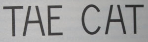
For example, we don’t normally notice the blind spot we all have, since our brains gloss over the missing information. An English speaker will read the following image as “THE CAT” (from Oliver Selfridge) even though the second and fifth symbols are exactly the same intermediate shape:
Another very effective demonstration of the power of top-down knowledge is the hollow face (the rotating mask illusion is widely available online and can be seen here). Our familiarity with faces makes it very difficult for us to see a hollow face. When we watch a hollow mask of a face rotate, we cannot help flipping the concave side into a “normal” face. Our knowledge, both innate and experiential, of what faces look like overrides the bottom-up information from the eyes of texture, perspective and even quite strong stereoscopic information.
Daniel Dennett tells the following joke to illustrate how unthinkingly we fill in gaps in a story:
A man went to visit his friend the Newfie and found him with both ears bandaged. “What happened?” asked the man, and the Newfie replied, “I was ironing my shirt when the telephone rang.” – “That explains one ear, but what about the other?” – “Well, I had to call a doctor!”
Notice that the text is radically enthymematic – gappy. It never mentions answering the telephone or putting the iron to the ear or the similarity in shape of an iron and a telephone receiver. Those details you fill in for yourself, and you have to have the requisite knowledge, the know-how, to do it.
Perception itself is not simply a matter of bottom-up processing of physiological signals arising from physical reality. They are top-down creations of the brain that depend on the knowledge we already have about how the world works.
Company policy, however, remains that we do not rely on readers to compensate for our poor performance when it comes to proofreading.
Clarity is underrated!
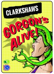
Of course, filling in gaps and jumping to conclusions are all very well, but we know that we don’t always get it right. The other day I ordered a local beer (brewed in Brixton, not far from our office) called “Gorgon’s Alive!“, except I read this as “Gordon’s Alive!” and wondered what all the green snakes were doing on the label. English sentences such as “Michael’s alive” or “David’s alive” have literal meaning but little cultural value, unlike the phrase “Gordon’s Alive!” – made famous (and into a successful meme) by the booming voice of Brian Blessed in the film Flash Gordon. “Gorgon’s Alive!” is an even less likely English sentence, and so is easily brushed aside and substituted by the far more famous phrase.
Reading what we think is there rather than what is actually there is just one of the hazards of proofreading, but unlikely to ever lead to dire consequences, other than perhaps ordering the wrong bottle of beer. Except in some circumstances the legibility of lettering really is a matter of life and death, as an exhibition at the Wellcome Collection – Can Graphic Design Save Your Life? – shows. In a review, Stephen Bayley writes:
Exhibit A. It is 1958 and you are barrelling down a dual carriageway; the 70mph limit is still eight years away. The road signs are nearly illegible. You miss your turning, over-correct, hit a tree and die. The following year, graphic designer Margaret Calvert is driving her Porsche 356c along the newly built M1. The motorway signs are hers. It is information design of a high order, possibly even life-saving. The clarity and intelligence of Calvert’s British road signs remain unmatched nearly 60 years later. And the font she created became the NHS, and later rail and airport, standard.